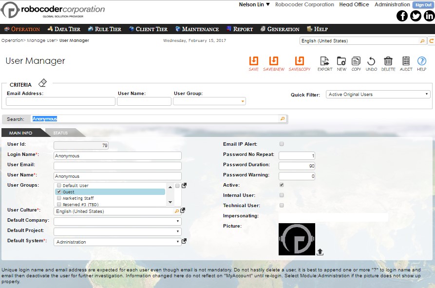
Data Entry Management
Chapter 1
Data Tier
Rintagi, the rejuvenating code generator that embraces late-change-no-penalty and change-on-the-fly, requires a blueprint of information (metadata) to generate the appropriate codes for the desired data entry screen. Each data entry screen is composed of the following tiers:
1.  Data tier that contains logical representation of the physical database,
    tables, columns, and virtual foreign keys
2.  Client-tier maintains display and validation characteristic of each input
    fields and navigation components of the screen.
3.  Rule tier controls visibility and readability of each column, and optional
    business rules on
Because Rintagi is self-generated, all the functionality described above can be repurposed for any of the data entry screens within Rintagi.
Rintagi provides built-in screens for capturing and maintaining information about the tables and columns in the physical database.
Logical Data Schema
Most web-based applications today are data-bound and a significant portion of an application’s actual usage involves data entry and maintenance by users. To ensure data integrity, developers have been using ‘strongly-typed data objects’ and associated validation logic.
This approach is mandated by design and best practices, but time and budget pressures often cause developers to cut corners. In addition, developers can be overwhelmed by the massive and mundane task of adding type-checking and data validation logic to hundreds, or even thousands, of web pages.
Unless extensive resources are deployed to perform System Acceptance Testing and User Acceptance Testing, applications may be implemented without the appropriate data validation logic in place. The results can be disastrous. Over time, valuable and costly data assets can be corrupted by incorrect data and typos. The prohibitive costs required to clean up this data often outweigh the value of the data itself.
Rintagi provides two solutions for developers. First, Rintagi generates applications with ‘strongly-typed’ data access objects. An error could be returned by the appropriate database if the data entered does not match the types specified in the database. Nevertheless, most if not all the data entry errors are captured by a variety of built-in data field validation types and their corresponding data input validation. Developers can specify these advanced column validation types in Rintagi, and the generated code will use this type when generating the database access code. More advanced developers may add their own custom constraint business rules to validate data entry.
Second, Rintagi regenerates applications, including itself, when a better type-checking mechanism is developed. This improved type-checking mechanism can be applied to all the regenerated applications at any time without retesting all of the changed applications. This learning capability differentiates Rintagi from other code generators.
Data Table & Column
Command: Data Tier -Data Table and Column
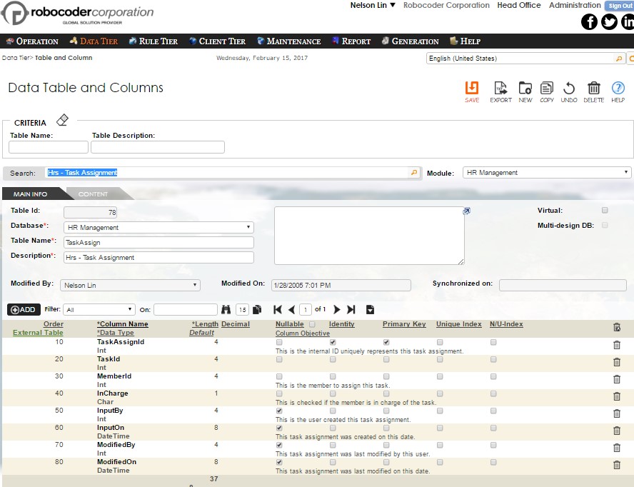
Rintagi is not a data-modeling tool but it can create and modify database table schema definitions. It shows the database tables selected to use in the application as well as schema information for each table. Aside from the primary index being created when synchronizing to physical database, one more index can be set up by simply checking the column(s) to be included. Rintagi recommends virtual foreign keys so no physical foreign key should be required.
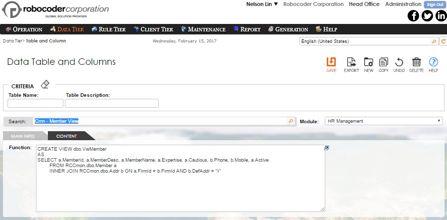
Each record in the above diagram represents a physical table, a view or a table-valued function in the designated database. The latter is a powerful feature to give performance to the application when too many database views are present. This table-valued function can be checked as Virtual and recorded in the Content tab as below:
The table name is the same as the physical name. The column names are the same as the physical column names. Multi-design Database is checked only if the table is an administration table and the same table should appear in each application database’s associated design database. This is only used when modifying Rintagi itself.
| Schema Characteristics | Description |
|---|---|
| Order | This is the order of the columns in the physical database at least 10 apart. If this is not entered or the last digit is not a zero, it will be renumbered accordingly. |
| External Table | This external table captures the name of additional table for the column that requires access |
| Column Name | The name of the column in the physical table. |
| Data Type | The following data types are available: BigInt, Binary, Char, Date, DateTime, Decimal, Int, Money, NChar, NVarChar, SmallInt, TinyInt, VarBinary, VarChar. These data types will be translated to the appropriate data types for Microsoft SQL DBMS. The special data type “Date” will be translated to “DateTime” in the physical database but the time portion will be suppressed to zero by the generated codes. |
| Length | The column length of the column in number of bytes. In particular, this is always 8 when BigInt, Date, DateTime, or Money is selected above; 4 when Int is selected; 2 when SmallInt is selected; 1 when TinyInt is selected. A 0 represents maximum for NVarChar, VarBinary, or VarChar. |
| Scale | The number of decimal places for “Decimal” data type. |
| Default | The default value when nothing is entered for a not null data column. Non-numeric value is enclosed in single quotes . |
| Allow Null | Check this if the column can be null. |
| Identity | Check this if the column is an identity column. |
| Index | Check this if the column is part of the index to be created when synchronized to a physical database. |
| Primary Key | Check this if the column is the primary key column. Currently one and only one primary key must be present for each table to be used in the application. |
Three action icons are provided for interoperability between physical database and this logical data schema:
Action Icons
| Icons | |
|---|---|
 |
This is the order of the columns in the physical database at least 10 apart.If this is not entered or the last digit is not a zero, it will be renumbered accordingly. |
 |
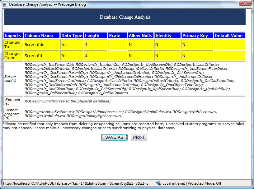
Click here to analyze the impact upon synchronization to the physical database; Columns from external tables will be ignored. Only tracked information will be analyzed. Currently this is only available for Microsoft SQL server. |
 |
Click here to synchronize to the physical database (analysis must be done immediately prior); Columns from external tables will be ignored. This is for the convenience of making sure the logical data columns used in the applications are in fact the same as those in the physical database. Currently this is only available for Microsoft SQL server. Upon successful update, a script will be added to the current version on Operation -> Release Tracking |
characteristics including names are simple. A comprehensive report (as shown below) will be provided for analysis by the middle action icon above:
Comprehensive Analysis Report
Virtual Foreign Key
Ordinary foreign key protects referential integrity and indicates relationships among tables. Rintagi recommends virtual foreign keys only for the drop down list or combo box displays. Physical foreign key is unnecessary as referential integrity could be handled by constraint business rules (to be discussed in later volumes). In fact, physical foreign keys can be a problem to some upgrade deployment operation and therefore is strongly discouraged.
Furthermore, if a data entry screen has two or more tables defined as a master-detail relationship the primary key column of the master tables must also exist in the detail tables as a non-primary key column so an implicit one-to-many foreign key relationship between the master tables and the detail tables is assumed.
The appropriate virtual foreign key is automatically inserted when a dropdown, autocomplete, combobox, document, or listbox are declared for a column to link to another table within the Screen Column Characteristic described in the next chapter.
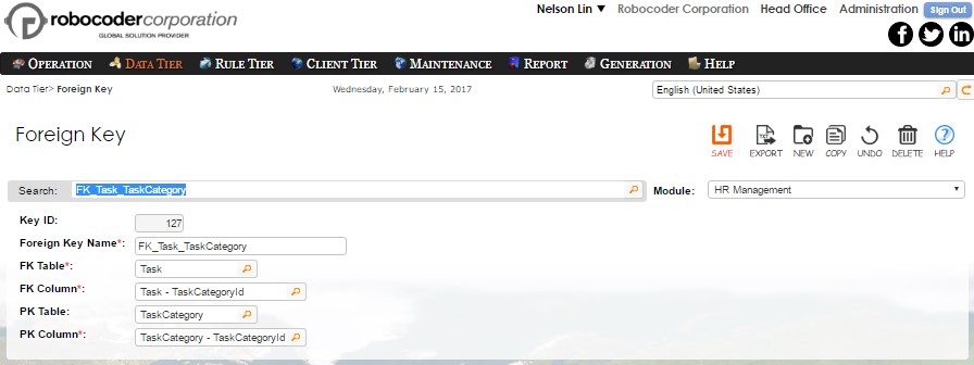
Command: Data Tier -Foreign Key
| Column | Description |
|---|---|
| Foreign Key Name | This is a unique name fifty characters or less being used to identify this unique foreign key relationship. It is recommended that the name to be prefixed by “FK_” followed by the foreign key table and the primary key table separated by an underscore. The foreign key table to primary key table is a many-to-one relationship. |
| FK Table | This is the foreign key table name and is usually the table that hosts the dropdown list. |
| FK Column | This is the foreign key table column that forms a many-to-one relationship with the dropdown list. |
| PK Table | This is the primary key table and is usually the dropdown list table. |
| PK Column | This is the primary key column that forms a one-to-many relationship with the foreign key table column. |
Chapter 2
Client Tier
The Client Tier provides built-in screens for defining the characteristics of display, validation, and navigation of a data entry screen.
Screen Types
Rintagi currently provides three data entry screen types.
1.  Tab-Folder with Grid
2.  Tab-Folder Only
3.  Data-Grid Only
These can be extended as easily as Rintagi modifies itself. Rintagi encourages each enterprise organization to use its unique copy of Rintagi to generate its own specific codes on an architecture that runs on the company’s specific platform.
Tab-folder with Grid
The Tab-Folder above updates one row of data for the master table. The Data-Grid below updates unlimited rows of information that associate the detail table with the master table row above. The Implicit Foreign Key is the primary key of the Master Table.
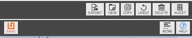
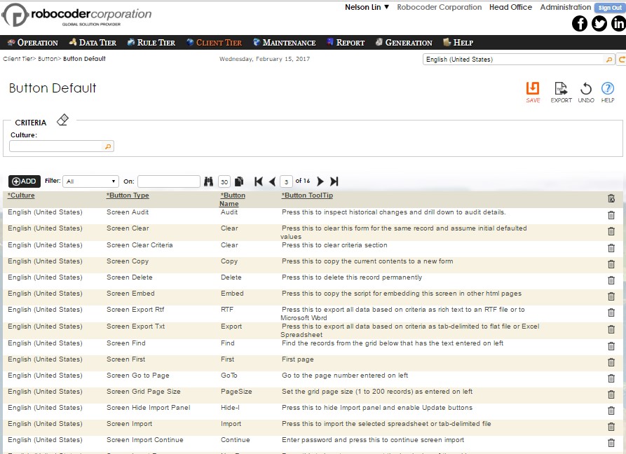
Each screen comes with standard buttons as follow:
| On Desktop: | On Mobile |
|---|---|
 |
These buttons have the following characteristics:
| Column | Description |
|---|---|
| Export | Press this to export all data based on criteria as tab-delimited to flat file or Excel Spreadsheet. |
| Rich Text | Press this to export all data based on criteria as rich text to an RTF file or to Microsoft Word. |
| New | Press this to clear this form for a new record and return to initial default value. |
| Copy | Press this to copy the current contents to a new form. |
| Undo All | Press this to undo all changes made so far on this screen. |
| Save | Press this to save this record into the database. |
| Delete | Press this to delete this record from the database. |
| ? | Press this to show context-sensitive information about this screen. |
Each Data Grid has the following navigation and management toolbar:
On Desktop:

On Mobile:
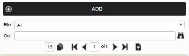
The characteristics are:
 Click this to add a new row just
below this tool bar.
Click this to add a new row just
below this tool bar.
 This filter allows
specific text to be searched for the entire Data Grid “All” or for a
selected column.
This filter allows
specific text to be searched for the entire Data Grid “All” or for a
selected column.
 Selected column can be sorted
upon the next data retrieval. This overrides the initial sort defined in
OBJ-Property. Users may click the header directly on the grid to toggle
ascending and descending sort to override this.
Selected column can be sorted
upon the next data retrieval. This overrides the initial sort defined in
OBJ-Property. Users may click the header directly on the grid to toggle
ascending and descending sort to override this.
 Enter the desired page size (1 to
200) and click the button to reset the maximum page size.
Enter the desired page size (1 to
200) and click the button to reset the maximum page size.
 This page navigator
enables first page, previous page, next page, or the last page to be
displayed. It will jump to the desired page entered in the middle if
changed.
This page navigator
enables first page, previous page, next page, or the last page to be
displayed. It will jump to the desired page entered in the middle if
changed.
 When pressed, the
import panel below will appear and update button enabled..
When pressed, the
import panel below will appear and update button enabled..
| On Desktop: | On Mobile: |
|---|---|
 |
You may also enable grid import functionality by having an extra panel to import data directly from a spreadsheet. This can easily by accomplished via Button Override described in the Advanced Topic of this user manual.
The “Tab-Folder Only” data entry screen updates one row of data at a time for the master table and there is no detail table.
Tab-folder Only
On Desktop:
On Mobile:
If multiple rows of data need to be viewed and updated at once, the Data-Grid Only data entry screen allows updates of unlimited rows of data to the master table with no detail table, as shown below:
On Desktop:
On Mobile:
Unless complex business rules have been set up for a screen, reselecting the screen type and regenerating the codes will change a screen from Tab-Folder Only to Data-Grid Only, and vice-versa.
Notice: Some screens may have optional criteria as shown below. This is covered in advanced topics of later volumes. On Desktop:

On Mobile:
Rintagi promotes one login for all databases when using the same application. There is a location at the top to select which database to process. This dropdown list is composed of at least two items, plus as many databases as desired. The two mandatory items are “Administration” and “Common Area”. “Administration” is the database that customizes and manages Rintagi and also its generated applications. This is analogous to the movie i-robot where “the robot that builds other robots can regenerate itself”. The “Common Area” is the database that manages information that may be common to all other systems within the same application. In a normal business environment the common information could be “Customers”, “Vendors”, etc.. You may change the name of this database at your convenience and add your desired functionality here.
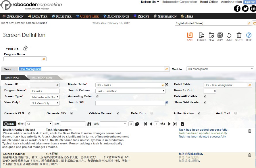
Screen Definition
Command: Client Tier -Screen Definition

The Tab-Folder information for each screen definition can be entered as follows:
| Column | Description |
|---|---|
| Program Name | This unique Program Name for this screen can be up to 20 characters . |
| Screen Type | Choice of: Tab-Folder with Grid, Tab-Folder Only, and Data Grid Only. |
| Search Column | The column to be used for searching a record inside the master table. It is only applicable for the “Tab-Folder Only” or “Tab-Folder with Grid” types. |
| Search Width | The display width of the above search column in pixels. Default is 300 pixels if not specified. |
| Ascending Order | Check if the above Search Column should be sorted in alphabetical order. It is only applicable for the “Tab-Folder Only” or “Tab-Folder with Grid” type. |
| Generate | Uncheck this if no programs should be generated for this screen temporarily. |
| Validate Request | Uncheck this if script-injection-attack is not a concern and inputs should allow html tags. |
| Detail Table | The detail table for the screen to be created. It is only applicable for the “Tab-Folder with Grid” type. |
| Rows for Grid | The initial number of rows to be displayed on detail grid. This number can be changed by each individual user for each individual screen and memorized by user per screen. It is only applicable for the “Data-Grid Only” or “Tab-Folder with Grid” type. |
| CssClass for Grid | Only applicable to "Tab-Folder with Grid" as grid will be display on the right if the class is not empty. |
| Title for Grid | The title for this grid, if applicable. |
| DeleteAll Visible | Check this if the "Delete All" option should be visible on data grid. It is only applicable for the “Data-Grid Only” or “Tab-Folder with Grid” type. |
If “CssClass for Grid” is specified, the “Tab-Folder with Grid” will have the grid placed to the right of the tab-folder as follows.
Grid Placement
The Data-Grid of Screen Definition captures all cultural specific information about the screen to be created. This information can be entered or edited as follow:
| Column | Description |
|---|---|
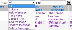
| Culture | The culture and locale for the screen messages, default culture should be one of the rows. |
| Help Message | The initial on-line help for this screen is 400 characters or less. |
| Foot Note | The initial on-line foot note for this screen 400 characters or less. |
| Screen Title | The title for this screen is 50 characters or less. |
| Add Message | The default message upon successful insertion. |
| Update Message | The default message upon successful update. |
| Delete Message | The default message upon successful deletion. |
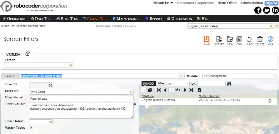
Only one row of title and messages should be entered in the designated default culture. As an example, indicate U.S. English, and the automatic translation can be invoked to add additional rows of title and messages in other desired human languages. This will be discussed later in advanced volume.
Screen Column
New screens are created when the “Insert” button is pressed on the previous “Screen Definition”. The columns in the master/detail tables specified are brought into the “Object IDE” screen automatically.
Note: In the case of “Tab-Folder and Grid” screen type, the detail table must have a foreign key column with the same name as the primary key column of the master table.
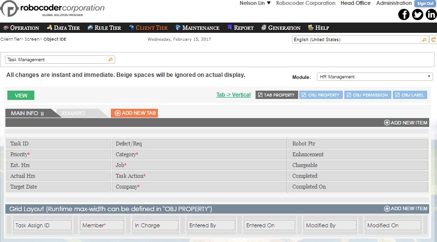
OBJ-Property
Be sure to delete the screen column reference to the foreign key column of the detail table. Except width, height, and the columns in the data grid, all changes made here require code generation and subsequent compilation to see the effect.
Validation
First, select the appropriate database. Then select the appropriate screen to be edited. A list of columns will be displayed. In the case of a “Tab-Folder with Grid” screen, in the detail table, be sure to delete the foreign key column to the master table. It would be implicit and redundant here. Check “Master Table” - if the column is from master table, un-check this box otherwise. “Mandatory” should be checked when the data column “Allow Null” is unchecked. “Mandatory” is always unchecked if the data column is an identity column or a value (e.g. “getdate()” is entered in “System Value”).
In the case of a dropdown or combo-box display, the first row is always chosen by default. The first row is always an empty row (null) when this “Mandatory” column is unchecked. If “Mandatory” is checked and the column is visible, non-identity and not a checkbox nor a dropdown, then the generated screen requires a value to be entered for the corresponding column. If these criteria are not met then a user-defined error message in the selected culture will be prompted.
An unlimited choice of “input masks” can be built for data input validation. Range can also be easily specified as a validation option.
For example, the database might specify a North America phone number column as a "varchar" column. In Rintagi, an “input mask” “([0-9][0-9][0-9]) [0-9][0-9][0-9]- [0-9][0-9][0-9][0-9]w+” can be used so that a phone number such as “(555) 555-5555 xtn55” can be enforced. Another example can be a date column restricted to a minimum value of “2000.01.01” and a maximum value of “2099.01.01”.
Display
Rintagi takes advantage of the data types specified in the database to generate specific access functions that are strongly-typed. In addition, a list of display types below provides client-side validation prior to data reaching other tiers.
| Display Types | Description |
|---|---|
| Action Button | No database column is required for this display type. A button will be created with the label entered into the Column Header. A Web Rule, described later in advanced topics, should be entered in order for the “onclick” event to take the desired action. |
| AutoComplete | Each character entered would automatically trigger a wild search for the phrase entered. All punctuations in the result set is ignored during the search and “*” is ignored in the search string. The first 100 items are selected each time with a scrollbar if necessary. Unless an item is clicked or selected, tab would trigger selection of the first item. A click on the search icon on the right would bring back 100 items from the top without any consideration on the search string entered. |
| Calendar | Only applicable to the Datetime database column. A calendar will be displayed to capture a date. |
| CheckBox | The preferred display for data column char(1) that has ‘Y’ for Yes and ‘N’ for No. Code generated automatically, it does the appropriate conversion upon “Check” or “Uncheck”. |
| CheckBoxAll | The same as “CheckBox” with an additional checkbox on top of the grid, in the header for this column. When the additional checkbox is pressed, all the checkboxes within the column in the grid as displayed are changed. Rows filtered out are not affected. |
| ComboBox | This is obsolete as of January 2012. It is kept here for backward compatibility purpose. Its functionality is essentially replaced by AutoComplete. The preferred display for a dynamic list of items that may span more than a page. User may perform wild search to narrow the dropdown list and/or to navigate via first, last, prev and next buttons. |
| ComboBoxNoPunc | This is obsolete as of January 2012. It is kept here for backward compatibility purpose. Its functionality is essentially replaced by AutoComplete. The same as ComboBox, except all punctuations will be stripped prior to being searched. For example, if the search is “abc”, all of the followings will be displayed in the drop down list: “a,bc”, “a=+b$c”, “abcdjsjad”, etc. |
| Currency | The numeric value is displayed in the currency of the culture specified and delimited automatically. A typical data type suitable for this is monetary or decimal. |
| DataGridLink | This is particularly useful if, instead of grid layout, the tab-folder display is preferred for a detail table while the master table requires a list with a link to launch and edit each item in the detail table,similar to a DropDownList.For the virtual foreign key to work properly the master table should have a column named the same as the DropDown KeyColumn name of the detail table. The number entered as height becomes the number of rows to display in the list. This master table column allows a null value and remains empty as a dummy. A business rule should be set up to update the DropDown KeyColumn of the detail table with something similar to the following: “window.open("AdmAppItem.aspx?id=213&key=5&typ=N&sys=3","AI213","scrollbars=yes,resizable=yes,width=850,height=500"); return false;” where AdmAppItem.aspx is the detail table screen program name, id=213 is the menu id for this screen, key=5 is the primary key value of the detail table, typ=N strips all navigations upon popup and “AI213” is a unique name defined by the developer for the popup browser. Don’t forget to “return false” to avoid postback. |
| Date | Only applicable to Datetime column. The format “d-MMM-yyyy” will be displayed. The date entered can be in any date format unless a mask is specified. |
| Datetime | Only applicable to Datetime column. The format “d-MMM-yyyy hh:mm” will be displayed. The date entered can be in any date or datetime format unless a mask is specified. |
| Document | This display type requires that the column is an integer. A linked document storage table named the same this column will be created automatically and reference columns selected on your behalf. The Dropdown Key Column is the linked table’s DocId and the Dropdown Ref Column is the linked table’s DocName. A virtual foreign key to the linked table is also automatically created. This Document type is preferable to the Upload type described below as the document uploaded is stored in the database instead of the file system. In addition, versions are managed and dislayed, making it more secure. Due to potentially large attachments, the document activities (add/overwrite/remove) are posted immediately to the document table without waiting for the Save button to be pressed. |
| DropDownList | This is preferred for a short list of items that do not grow significantly over time. The first item is always selected as a default. In the case of a non-mandatory column, a null will be added to the list and be selected as a default. |
| HtmlEditor | This is a multiline textbox with basic powerful functionality for editing a HTML page. The database column is usually nvarchar(max). |
| HyperLink | The content of this column (string only) will be displayed and the content of the DropDownKey column will be treated as a hyper link if one of the following three scenarios happens: • If an “@” sign is found it is considered an email to be mailed. • If a “:” is found it is considered one of those “http:”, “https:”, “file:” etc. to a URL or file or executable program provided. • Otherwise a relative path is assumed to the URL or file or executable program specified. The DropDownKey column must be present as a column in Screen Column Design and usually set to invisible. For tab folders please add an extra column to update the displayed column unless it is controlled by server rules. All “HyperLink, ImageLink, HyperPopUp, ImagePopUp” columns are not updated on tab folders, so is ImageButton with VarBinary as data column. DataGrid edit takes care of the update for the same column and will be updated. |
| HyperPopUp | Same as HyperLink, except a new browser will be opened. Use HyperLink instead of HyperPopup in the case of an executable program. This is most suitable for a URL or file that requires a browser to open. The content can be filled with a business rule similar to the following: “AdmScreenObj.aspx?id=26&key=1121&typ=N&sys=3” where AdmScreenObj.aspx is an existing screen program name, id=26 is the menu id for this screen, key=1121 is the primary key value of the table row to be launched, typ=N strips all navigations upon popup and sys=3 is the SystemId representing the database of a multi-database design screen and is only applicable to Rintagi itself. |
| ImageButton | Desired image will be displayed from the following three modes: •Data column is VarBinary(max): image will be uploaded into the database and size may be reduced based on the pixels defined in height and width; •Data column is TextBox: the url of the image is expected; •Data column is empty: the url of the stock image should be in the Default Value; |
| ImageLink | This column can be a string containing an image URL or an integer representing a foreign key to a document table identified by the statement “UpLoad.aspx?tbl=dbo.AppZip” specified in Search Link. ImageLink is the same as HyperLink except an image will be displayed instead of text in the column. A stock image “Link.gif” (tab-folder) or “GridLink.gif” (DataGrid) is used if the DropDownKey column is the same column. Unlike HyperLink, DropDownKey column may be emptied to show only the Image. |
| ImagePopUp | Same as HyperPopup except a stock image “Link.gif” (tab-folder) or “GridLink.gif” (DataGrid) is used if the DropDownKey column is the same column (otherwise the value in the column will be used as the image). Use ImageLink instead of ImagePopup in the case of an executable program. This is most suitable for a URL or file that requires a browser to open. |
| ListBox | This is used for both criteria and data entry. In criteria, more than one selection can be used to filter a data row display. In data entry, more than one selection can be stored with comma delimited enclosed in “(“ and “)” within a varchar(1000) field. This is ideal to avoid creating a many-to-many table when the list of selections is no more than a few hundreds. |
| LongDate | Only applicable to Datetime column. A long date in the format specified by the culture will be displayed and captured. The date entered can be in any date format unless a mask is specified. |
| LongDatetime | Only applicable to Datetime column. A long datetime in the format specified by the culture will be displayed and captured. The date entered can be in any date or datetime format unless a mask is specified. |
| Money | The numeric value is displayed delimited by the culture specified and only two decimals. The typical data type suitable for this is money. |
| MultiLine | The default display setting for non-numeric data columns designed to store more than one line - usually having a carriage-return and line-feed. More than one line can be entered at a time and the height of the TextBox can be of any number of pixels specified. Typical data type suitable for this is Varchar or NVarchar, if many characters are allowed. |
| Password | The display setting for the password data column. Any characters entered will be displayed as an asterisk ‘ * ’ but stored as the original character typed. |
| Placeholder | This is used for advanced level. A web rule is usually present to manipulate this placeholder. No database column is required. |
| ProgressBar | Underlying data type should be tinyint. Useful for showing progress via the extent of a bar highlighted. |
| RadioButtonList | This is usually used instead of a checkbox or dropdown which has very few items. A list of radio buttons will be displaced for selection. If it is non-mandatory, the first item is null and is without any label. |
| Rating | This is useful for rating purposes capturing a small numeric value via the number of stars selected.The database column is usually tinyint |
| ShortDate | Only applicable to a Datetime column. A short date in the format specified by the culture will be displayed and captured. The date entered can be in any date format unless a mask is specified. |
| ShortDatetime | Only applicable to a Datetime column. A short datetime in the format specified by the culture will be displayed and captured. The date entered can be in any datetime format unless a mask is specified. |
| TextBox | The default display setting for alpha-numeric data columns. Usually left-justified. Unless a specific data mask is used, this will accept any character. Datetime data column using the TextBox display will display both date and time information. |
| Upload | Instead of Document display type, this is sometimes used to capture documents to the file system with the relative path saved in the database column (usually varchar(200) or above). This path can then be referenced to be displayed as an image or hyperlink. The relative path directory is “data/docs/name of the screen program”. It can be override in the Search Link. Documents with the same name will be replaced by the latest. |
Below is a table of comparison of the characteristics of some of the key display elements:
| Database Column | Dropdown Key Column | Action | Table Folder | Data Grid | |
|---|---|---|---|---|---|
| Action Button | Optional: Button label is displayed from the text in this field when present. Otherwise from the Column Label. | N/A | Action defined by web rule. | Always show button. | Show button on view mode. Database Column can be edited when present. Otherwise show button also in edit mode. Width is relevant to the button only in the absent of Database Column. Height affects the button. |
| Image Button | Optional: Image is displayed via the url in this field when present. Otherwise imageurl refers to the Column Label. | N/A | Action defined by web rule. If absent, it acts as an image only. | Always show image. | Show image on view mode. Database Column can be edited when present. Otherwise show image also in edit mode. Width is relevant to the image only in the absent of Database Column. Height affects the image. |
| Image Link | Mandatory: This is the url for the image to be displayed. If this is the same as the Dropdown Key Column, a default image gridlink.gif will be displayed. | Mandatory: This is the url link when clicked. | Navigate to another page based on the link. | Always show image. | Show image on view mode. Database Column can be edited. Width is relevant in the edit mode. Height affects the image. |
| Image Popup | Same as the above. | Same as the above. | Popup another page based on the link. | Always show image. | Same as the above. |
| Hyper Link | Mandatory: This is the text to be displayed as the link. | Same as the above. | Navigate to another page based on the link. | Always show hyperlink. | Show hyperlink on view mode. Database Column can be edited. |
| Hyper Popup | Same as the above. | Same as the above. | Popup another page based on the link. | Always show hyperlink. | Same as the above. |
Defaults
The “System Value” default resides server-side. These server-side default values or functions only initiate when nothing is entered for that column and before inserting or updating a database.
“Default Value” is the client-side equivalent of the server-side default “System Value”. If a value is entered into “Default Value” for a particular column, the corresponding value will show up on screen prior to inserting or updating the database. A date constant such as “12/31/9999” can be entered into “Default Value” but “System.DateTime.Today” can also be used to display today’s date as a client-side default. You may also use any of the system values such as UsrEmail, UsrId, UsrGroupId, InternalUsr, CultureId, Culture, RowAuthorityId, ColAuthorityId, InvestorId, CustomerId, VendorId, AgentId, BrokerId, MemberId, SystemId, CurrentSystemId by preceding the name with case-sensitive “LUser.” or “LCurr.” then closing with “.ToString()”. Many configuration settings in Web.config can also be referenced in “Default Value” by preceding the following with “Config.” then closing with “.ToString()”:
Four standard columns have been provided for the convenience of tracking the “who and when” of data that has been entered or modified. A column named “InputBy” can be a read-only dropdown that would be automatically assigned a UserId upon insert only; a column named “ModifiedBy” can be a readonly dropdown that would be automatically assigned UserId all the time. Both of these should be defaulted to “base.LUser.UsrId.ToString()”. A column named “InputOn” should be a readonly textbox that has getdate() as its system value which would be assigned only upon insert and a column named “ModifiedOn” should be a read-only textbox that has getdate() as its system value which would be assigned all the time. All four should be “Allow Nulls” in the database. “InputBy” and “ModifiedBy” should be dropdowns with UsrId & UsrName as key pairs. All “InputBy”, “ModifiedBy”, “InputOn” and “ModifiedOn” should be InputRequiredCheck “N” because default / system values have been assigned and readonly.
Import Match Instruction
Every data-grid comes with an import capability from any spreadsheet. Essentially there is no need to enter data into the data-grid if data is already filled inside a spreadsheet. This is particularly useful in accepting input from other organizations such as bank reconciliation, etc. Therefore, if the column is in a data-grid, and the display type is a dropdown, combo-box, radio-button, or list-box, you may select one of the following as the instruction for matching to the imported data:
- Key Match Only: If the key column of the dropdown does not match a value on the spreadsheet and the column is mandatory, report an error.
- All above then Exact Name: If the key column does not match a value on the spreadsheet and the ref column does not match, report an error when the column is mandatory. This is the default when not specified.
- All above then Starts With: If the key column does not match a value on the spreadsheet and the ref column does not match, inspect the ref column name and search for a name match that starts with the value on the spreadsheet. Report an error when all fails and the column is mandatory.
- All above then Wild Search: If the key column does not match a value on the spreadsheet and the ref column does not match, inspect the ref column name and match to any value on the spreadsheet. Report an error when all fails and the column is mandatory.
OBJ-Permission
The column default before override is simply visible, editable and exportable.
As screen columns are being defined, the screen column authorities for the default authority are automatically defined. Each column can be designated as non-visible, read-only or non-exportable. Additional column authorities can be added to each column. Moreover, tooltips,labels, error message can also be overridden.
OBJ-Label
The column default before override is simply visible, editable and exportable.
Configurations
The available configuration values from the file Web.config are:
| AppSetting | Description |
|---|---|
| SmtpServer | The smtp server for the notification server to send emails. E.g. Value = " true|555|pod.outlook.com|smtp@abc.com|hsdjhd" where the first item is ssl, second item is port, then server, username, encrypted password, domain. Missing item will be considered null. |
| MandatoryChar | This is the preferred character to be used to tell the user that the input column is mandatory. It can be empty. E.g. Value = "*". |
| ReadOnlyBColor | This is the background color to be used on read-only (non-editable) columns. E.g. Value = "WhiteSmoke". |
| PromptMsg | This is either “true” or “false”. When set to “true”, a modal message will popup to inform the user with action buttons such as Save, etc. E.g. Value = "false". |
| OrdUrl | Only relevant if the application accepts anonymous login. Change LoginModule.ascx.cs to return to this anonymous URL via Config.OrdUrl upon successful sign-out. E.g. Value = "http://localhost/ww/Anonymous.aspx". |
| SslUrl | This is only relevant if the application accepts anonymous login; You may change LoginModule.ascx.cs to return to this URL via Config.OrdUrl upon successful sign-out. This can be “https://” or “http://”. E.g. Value = "http://localhost/ww/Default.aspx". |
| AppNameSpace | This is the application namespace. E.g. value = "RO". |
| DeployType | This is the abbreviated representation of the status of the application. E.g. value = "DEV" means “Development”; “PDT” means “Production” and “PTY” means “Prototype”. |
| ClientTierPath | This is the directory where client tier programs reside. Value = "C:\Inetpub\wwwroot\RO2\Web\". |
| CLanguageCd | This is the language code for the client tier programs. E.g. value = "C". Currently “C” represents “C#” code. |
| CFrameworkCd | This is the Microsoft Framework code for the client tier programs. E.g. value = "3". Currently “3” represents .NET 3.5. |
| RuleTierPath | This is the directory where rule-tier programs reside. Value = "C:\RINTAGI\namespace\". |
| RLanguageCd | This is the language code for the rule-tier programs. E.g. value = "C". Currently “C” represents “C#” code. |
| RFrameworkCd | This is the Microsoft Framework code for the rule-tier programs. E.g. value = "3". Currently “3” represents .NET 3.5. |
| DProviderCd | This is the data provider code for the data-tier DBMS. E.g. value = "M". Currently “M” represents Microsoft SQL and “S” represents Sybase. |
| WebTitle | This is the title for the overall application when displayed on any browser. E.g. value = "RINTAGI". |
| LoginImage | This is the image to be displayed next to the login panel if a user preference has not been set up for the system that the user has logged in to. E.g. value = "../images/banner/TofWorld.gif". |
| BannerImage | This is the image to be displayed underneath the login panel if a user preference has not been set up for the system that the user has logged in to. E.g. value = "../images/banner/LogoGlobe1of2.jpg". Nevertheless, if "n/a" is entered in the user preference, the entire banner section will be suppressed. |
| PathRtfTemplate | This is the initial path to be displayed when importing a Rich Text file template to be used for document merging. E.g. value = "E:\Import\RO\RTF\". |
| PathTxtTemplate | This is the initial path to be displayed when importing an ASCII file template to be used for document merging. E.g. value = "E:\Import\RO\RTF\". |
| PathXlsImport | This is the initial path to be displayed when importing an Excel spreadsheet. E.g. value = "E:\Import\RO\XLS\". |
| PathTmpImport | This is the work area to be used when importing an Excel spreadsheet. E.g. value = "E:\Import\RO\TMP\". The files in this folder provide audit trails and need to be removed when extra space is required. |
| EnableSsl | When true, this application requires https secured access instead regular http access. E.g. value = "false". |
| DesProvider | This is used in the OLEDB connection string and represents the data tier’s DBMS. E.g. value = "Sqloledb". Currently “Sqloledb” represents Microsoft SQL and “Sybase.ASEOLEDBProvider” represents Sybase ASE. |
| DesServer | This is used in the OLEDB connection string and represents the data tier’s server name. E.g. value = "SERVER08". |
| DesDatabase | This is used in the OLEDB connection string and represents the data tier’s database name. E.g. value = "RODesign". |
| DesUserId | This is used in the OLEDB connection string and represents the data tier’s login user ID. E.g. value = "sa". |
| DesPassword | This is used in the OLEDB connection string and represents the data tier’s login password encrypted by a TripleDES algorithm. E.g. value = "jsadgYTYhbwj09893u=". Encrption can be done via built-in screen: Operation -> Encrypt Password. |
| DesTimeout | This is used in the OLEDB connection string and represents timeout values in seconds. E.g. value = "40". |
| DoubleByteDb | Not all DBMS supports double-byte characters. When false, only ASCII characters can be saved to a database. E.g. value = "true". |
Errors
Error handling is divided into Client-Side and Server-Side.
Validations via display type or mask usually result in client-side error messages. These error messages are described in the Screen Columns Maintenance.
Validations via data type or server-side business rules usually result in server-side error messages. (These will be covered in advanced topics in later volumes.) In the example below, even though it is a mandatory data entry column, the client-side error message will never be displayed because the display is a DropDownList whose first entry (which is empty) will be selected as a default.
If a developer has not specified his or her own error message, the strongly-typed data column will trap the error and rollback the transaction.
The rest of the Tab-Folder information can be entered as follows:
| Column | Description |
|---|---|
| Master Table | Check if the column comes from the master table of a Master-Detail relationship such as “Tab-Folder with Grid” screen type. For the other two screen types, “Tab-Folder” and “Grid”, this is always checked. |
| Mandatory | As described above. |
| Wrap | Uncheck if no-wrap is required. |
| Generate | Uncheck if temporary no programs should be generated for this screen. |
| Justify | Select the horizontal alignment of column display (Left, Right or Center). |
| Generate | Uncheck if temporary no programs should be generated for this screen. |
| Width | The width of the column in pixels. In the case of "Calendar" display, this becomes the font size. |
| Height | The height of the column in pixels or the number of rows in the DataGridLink display. |
| Tab Folder | Selects a folder for all tab-folder master columns and nothing for datagrid detail columns. |
| Tab Order | The tab order when navigating the columns. The default is an interval of 10 and reorder will take place automatically if the last digit is not a zero. |
| Sort Order | Use 1, 2, 3, etc. for initial sort order. A negative sign indicates descending order. On dropdown columns the dropdown reference description will be used for sorting when assigned a sort order. This could be resource intensive and is not recommended when: 1. Table showing up on the grid is cluster-indexed by the desired sorting sequence or 2. Only one column sort is required which can be accomplished easily when user clicks on the column header of the grid and it toggles between ascending and descending order. |
| Screen | The screen definition for this column. |
| Screen Group | An unlimited number of nested groups can be defined to organize the column appearance and navigation. (This will be covered in more details later in advanced topics.) There are four stock groups available: • C&L Horizontal (all labels and columns are aligned horizontally with label appearing on the left of column). • C&L Vertical (all labels and columns are aligned vertically with label appearing on top of the column). • C-Horizontal L-Vertical (all columns are aligned horizontally with label appearing on top of the column). • C-Vertical L-Horizontal (all columns are aligned vertically with label appearing on the left of column). |
| Database Column | Selects the database column to be updated by this column display. This is not mandatory. (For example: a checkbox can be created which is not a table column but rather an input to pass on to a server rule.) |
| Column Name | The unique name for this screen column, usually the same as the data column name, if applicable. |
| Display Mode | As described above. |
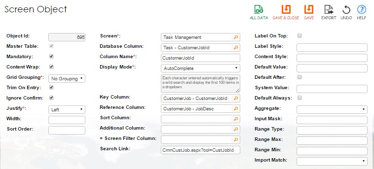
| Dropdown Key Column | If applicable, this is the key column of the dropdown, combo-box, list-box, radio-button. It can be used for an image source when “Image Link” and “Image Popup” are selected. This can also be the pull-up column from another table when the reference column below is the primary key of the pull-up table. |
| Dropdown Ref Column | If applicable, this is the displayed column of the dropdown or a reference to a previous column that is also the primary key of the pull-up table. |
| Dropdown Sort Column | When empty, this is the default sorting on the “Dropdown Ref Column”. This sort column should be from the same table as the key and ref columns. |
| DD Additional Column | When used, these specifications will be used to match the “Screen Filter Column” below to the same screen as the filter. This column should be from the same table as the key and ref columns. |
| Screen Filter Column | When used this will filter the above dropdown based on the match to the “DD Additional Column” above. This filter column should be from the same table as the screen column. |
| Search Link | Enter the program name required to popup in the form (example:"HrsTasks.aspx"). Add "&enb=N" if the form is view only. HrsTasks.aspx is the program to be called. You may also specify “&typ=Y” to display banner and menu upon popup which are stripped as default. “&ftr=?” can be used to specify a predefined screen filter. The first parameter should be preceded by “?”, not “&”. |
| Default Value | As described above. |
| System Value | As described above. |
| Aggregate | This is only applicable to a data-grid detail column. The aggregate instruction can be one of: the following: • Avg: Average • Cnt: Count • Sum: Sum |
| Refresh on CUD | When checked, this Combo-box/Dropdown column will be refreshed upon every Create, Update or Delete. |
| Input Mask | The input mask for TextBox display, if applicable. |
| Range Type | The mask type of the following range, if applicable. (i.e. an integer.) |
| Range Max | The maximum of the range mask. (i.e. 1000.) |
| Range Min | The minimum of the range mask. (i.e. 0.) |
| Trim on Entry | When unchecked, this column will not be trimmed upon any Insert or Update. |
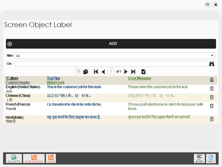
The Data-Grid captures all cultural specific information about the screen column to be developed. This information can be entered or edited as follow:
| Column | Description |
|---|---|
| Culture | The culture for the screen column messages. At least one row should appear with the default culture. |
| Column Header | The label for this column, if applicable. For an ImageButton display, it becomes ImageUrl. |
| Width | The width of this heading in pixels if the default is not applicable. |
| Error Message | This error message will be prompted for each empty column that has Mandatory checked, with the exception of dropdown, combo-box, checkbox and identity columns. |
| Tool Tips | The tool tips for the column in the selected culture. Tool tips will show up in all columns (except dropdown and combo-box). |
Menu
After completing the forms for Screen Definition and Screen Columns, the programs for the screen can be generated. (Program generation will be covered in later volumes.)
To inspect the screen for correctness, it can be assigned to a menu.
Command: Client Tier -> Menu IDE
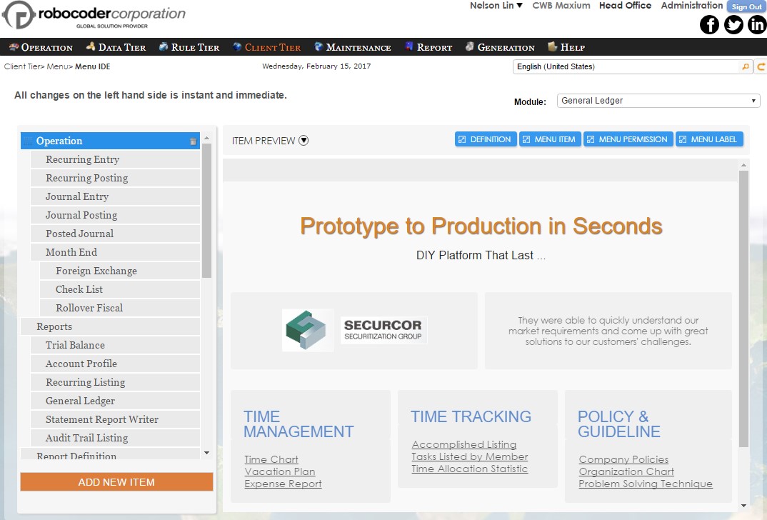
Select the appropriate database then enter a unique name for the menu item and select the screen recently generated. If a hierarchy is required, each new menu item inserted upon update will be added to the dropdown list of the selected Parent Item. Miscellaneous should be used if a custom or external program needs to be invoked. Only one of Screen, Report, Wizard or Miscellaneous should be selected for each menu item.
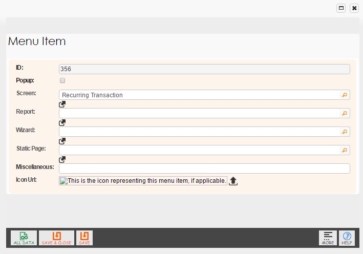
In Miscellaneous, either an absolute or relative path may be specified. (Example: http://www.rintagi.com or “CmnCompany.aspx?id=197&msy=5” where “CmnCompany.aspx” is the program name, “id” is the menu position and “msy” is the current system the menu should be displayed).
The menu item will be displayed in the name entered. If a different label is required, especially in a different human language, the following built-in screen can be used.
Menu Label
Command: Client Tier -> Menu Label
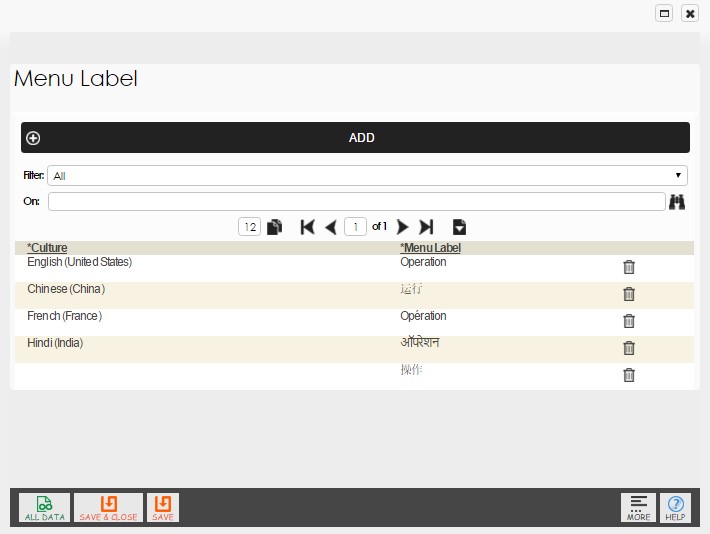
By selecting the appropriate human language, each menu item can be labeled differently. If no override label is provided, a U.S. English label will be displayed. Finally, each menu item can be assigned different permission levels by user role or membership. (This will be covered in more details in a later volume on rights management.) Menu Permission
Command: Client Tier -> Menu Permission
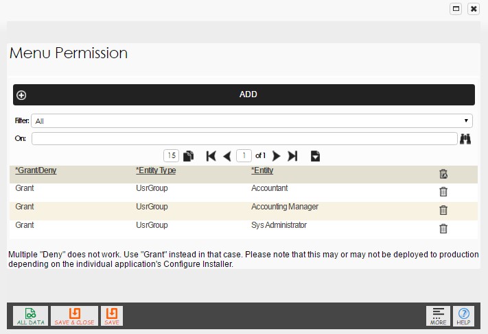
The default setting for any menu item is “Everyone” who has access to the respective database. When changed to “N” for “not everyone”, each menu item can be dedicated to be accessible by any of the following roles or memberships. Each row added represents additional access to the menu item:
•   User Group: This is user-defined and has a designated human language, locale,
    row and column authorities, internal/external, etc.
•   Company: The specific company user-defined.
•   Project: The specific project user-defined.
•   Agent: Typically used for sales representatives of one or more companies
•   Broker: Partners of one or more companies
•   Customer: Customers of one or more companies.
•   Investor: Investors of one or more companies.
•   Member: Typically used for an employee of one or more companies.
•   Vendor: Vendors to one or more companies.
Chapter 3
Rule Tier
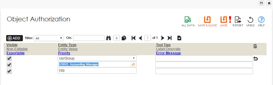
Visibility, readability and Exportability are among some of the dynamic properties that can be manipulated during run time and is covered in Object IDE in chapter 2. These properties can be assigned to a user-defined “Column Authorization Group” that can in turn be assigned to a “User Group”, then to a user.
Similarly, rows permission levels can also be assigned to a user-define “Row Authorization Group” that can in turn be assigned to a “User Group”, then to a user.
Business rules can be added to Rintagi-generated applications using the following methods:
- Server rule: This is most commonly used among the three types.
- Web rule: This is used for special user interfaces upon post-back.
- Client rule: This should only be used for special interfaces on the client-side.
These business rules will be detailed in later volumes. Each can be categorized into one of the following:
- Constraints:
- Computation:
- Inference:
- Action Enabler:
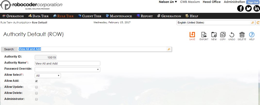
Default Row Authority
Each default row authority can be named and assigned “CRUD” ability. That is, “Add”, “Select”, “Update” and “Delete” authority. They can be assigned to a particular user or user group where each screen can be further overridden.
Command: Rule Tier -> Authorization -> Row Default
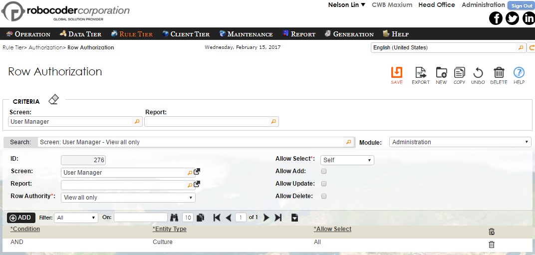
Row Authority
Unlike screen column authority, screen row authority is usually empty. All screens take on the defined properties of the default row authorities unless override. Any addition to the screen row authority will override the default properties.
Command: Rule Tier -> Authorization -> Row Authority